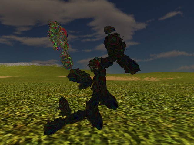
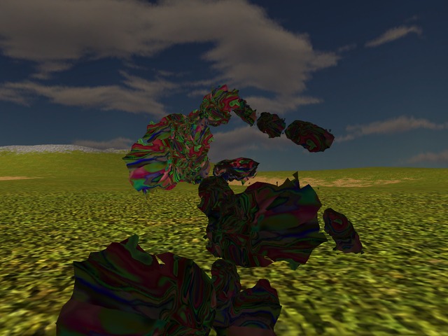
This time I'll start with 3 illustrations since I found that I'd rather paint of sorts than write these days 1 and supposedly the pictures are anyway worth lots and lots of words. So here's in order my texture generator's take on Impressionism, Naive and Surrealism painting styles and feel free to disagree most strongly for it totally doesn't care about your disagreement:
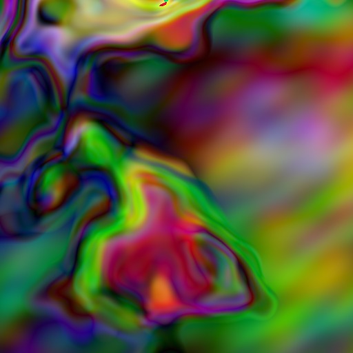
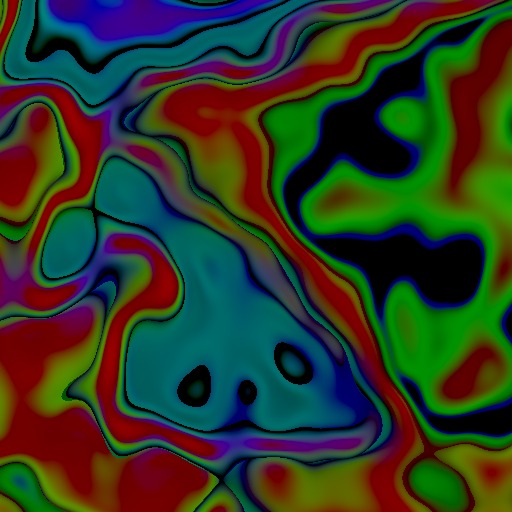
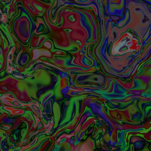
If you compare the above with the previous styles featured in this series (such as the Escher-like or the swirly river), you might get perhaps some idea that there are some specific choices made so as to obtain one style or another. Those choices focus currently on 3 main aspects that are worth setting out in clear and perhaps discussing in a bit more detail, too, in the order in which they come into play at texture generation time:
- Texture domain mapping.
- Pattern (where the whole fractal fun is going on atm).
- Colour domain mapping.
The texture domain mapping refers to the 3D shape that the generator assumes essentially to be the target of this texture - in other words, the resulting texture is meant to be a 2D picture of the surface of that shape, if one were to fully peel and set it flat. Unsurprisingly perhaps, the choice of the specific 3D shape *and* of the way in which the mapping to 2D is done has quite significant effects on the image obtained, even if *everything else* is kept the same. In principle though, provided that the exact inverse mapping is used when rendering the texture on the corresponding 3D shape, the two "different" images should end up as similar "skins" - though so far I haven't really spent the time to verify this fully in practice. In any case and for illustration, have a look at 2 textures that are generated using the very same pattern and colour mapping, only assuming first a hyperboloid 3D shape and then an egg 3D shape (just in case you needed to dress up your eggs and hyperboloids):
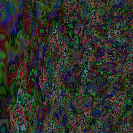
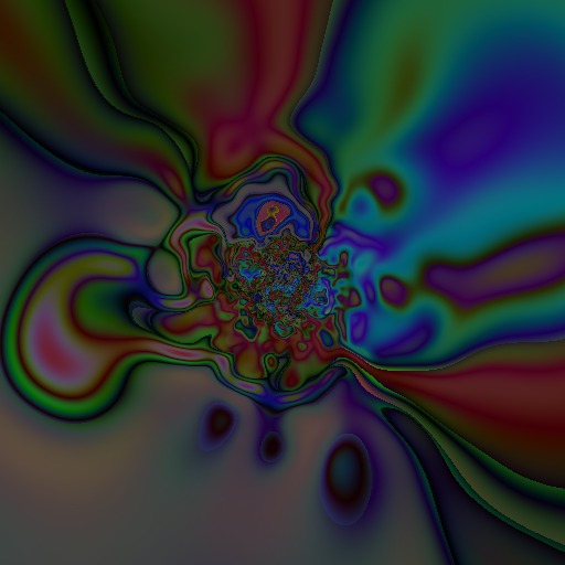
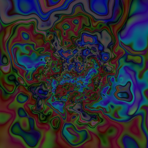
In addition to the shape itself, it's worth noting also that any 3D to 2D mapping will make further choices, out of necessity. Even for the very simple case of a sphere, there are several different mappings to a 2D representation and the choice depends mostly on what specific property of the sphere's surface interests you most (meaning: you'd rather have preserved in the 2D representation). Without going so far into all that detail, as I don't think it's all that crucial right now, I still had fun with adjusting the "zoom" factor of a stereographic mapping, hence the part of the sphere that is captured in the limited space of my 512x512 pixels texture. Unlike the earlier diagonal travel by means of (x,y,z) offsets through the river of eyes, this is literally a travel towards or away from whatever pattern you are setting otherwise. Besides the fun factor, this sort of movement in the texture space gives both different patterns (by focusing on one spot or another, as they can be quite different looking anyway) and a neat way to control otherwise where the detail ends up (or not) on the rendered mesh. At any rate, for the style of texture that is the focus of this article, the zoom in turns out for instance like this:
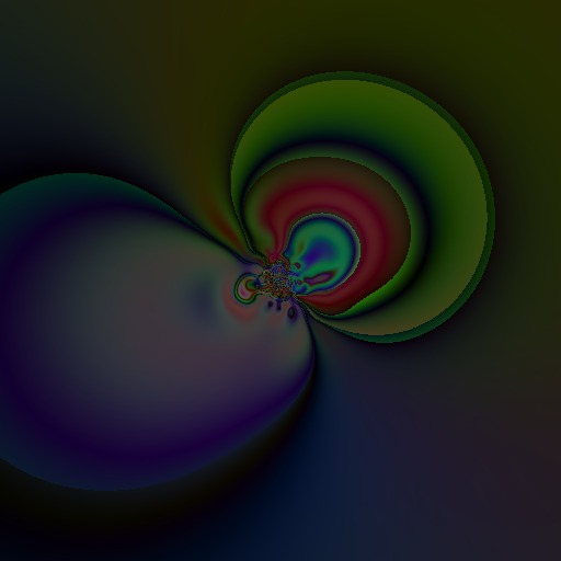
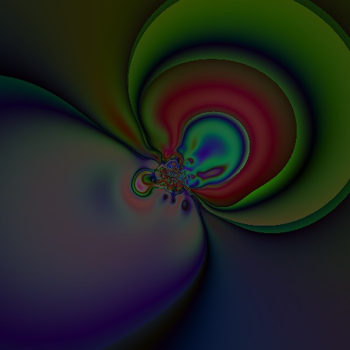
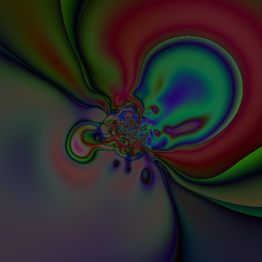
With respect to the pattern used for a texture, the choices are trickier to fully describe since in principle anything can go in here, from a predefined fixed, traditional pattern to any combination of fractals, multi-fractals, prng, trng, noise, interpolations and whatever else you can think of. Such choice doesn't necessarily mean that there is no overlap ie that you can't perhaps obtain the same thing through different means - in fact I'd rather say you surely can. What it means however is that it's SO very easy to get lost and play for hours with it all, even stumble upon some interesting stuff and then go nuts trying to ...find it again! So what can I say, like in any other labyrinth whose design is wider than you fully comprehend just yet, take your steps one at a time, keep detailed notes and be aware that even that might not be always quite enough.
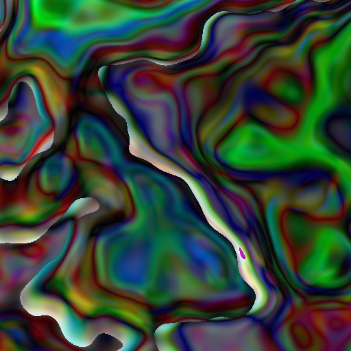
The above warning aside (and surely immediately forgotten too), for this set of textures I wanted to experiment with introducing some prng into the mix. Essentially the whole game of generating textures and shapes consists at core in finding just the right mix of structure (not enough structure means that the result will look simply like noise/nothing/random rubbish) and chaos (not enough chaos and you get stunted, boring, "un-natural"/nothing/rubbish). In other words, the structure has to be there for the meaning, while the chaos is desired in there for the fun, variety and anti-boredom property. In principle, fractals themselves are already neatly tuned combinations of both structure and chaos but tipping this balance and then re-setting it at a different point is exactly how you get different *styles* of pictures to start with - the previous swirls and river of eyes is what you get for instance with fixed offsets added to all three coordinates, basically translating the texture's domain with slightly different amounts on each of the axes. So if translation got me swirls, my next curiosity was to see: what does rotation do? And since I like all rotations just the same, so that I don't want to choose any in particular, I went all out and picked at *each* pixel, 3 pseudo-random numbers from an MT prng, to serve as the angles of rotation around each of the 3 axes. Note that using the MT prng is effectively introducing some tamed, approximate form of chaos really, given the pseudo-part. At any rate, the fbm with perlin noise is then used to calculate a value for the (x,y,z) triplets that are obtained in turn by rotating around the x axis, then around the y axis, then around the z axis. The result of it all raises some interesting sharp "ridges" and looks for instance like this:
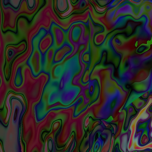
The above is only the beginning though. For once I got that, it was a given I'd want to further mess about with it. So next step was to apply on top of it, an effect I had previously discovered to give a sort of layered or transparent look to the whole thing - it's yet another application of the fractal brownian motion (fbm) with perlin noise, but applying different translations for x, y and z coordinates. Because a direct full "layered" application was clearly way too much coming after the rotation and one round of fractal transformations, I've further introduced in between a clamp on the coordinates so that the whole rotation+translation stays within some closer bounds. Interestingly enough, whether this clamp allows negative values or not makes in practice a *lot* of difference - basically straddling the origin and being comfortable with negative numbers gets one all the way from the naive to the impressionist:


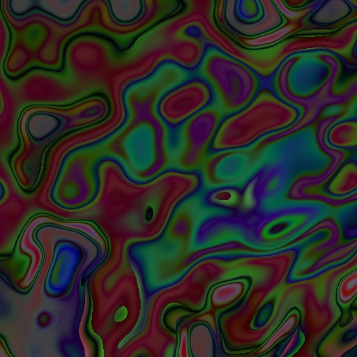
Further keeping the same but changing basically the "noisiness" of the fractal deformation itself yields a busier pattern both when using only the rotation + one fractal application and when using rotation+fractal+translation+fractal:
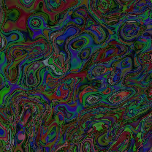
Having made it so far and therefore having set both the initial 3D shape (domain mapping) and the pattern (that rotation and possibly added translation with 2 sets of fractal brownian motions in the mix), I had to try out various combinations of the two, of course. Keeping all that rotation and translation with clamping and everything else but simply changing the domain mapping from the unit sphere 2 changes of course quite radically the result but I admit that I like that little face kind of forming on the right:

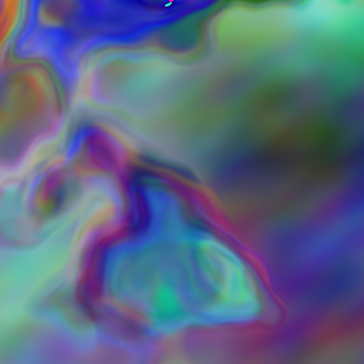
Finally, the last big choice to make is the colour domain mapping - basically deciding how to interpret as colours whatever bunch of numbers come out of all the previous calculations. Generally I kept this part really straightforward and very simple so far, mainly because I found it way more interesting to play with other bits: the values obtained are translated to [0,1] interval and then interpreted as % of the r,g,b (x for r, y for g, z for b). But since I tidied up and set nicely all those three different areas of play and whatnot, the unbalance of options was unsufferable really, so I did first this half-hearted what-if of considering instead a unit sphere in the R,G,B space - and I mean half-hearted as I didn't bother too much with either more interesting options or at the very least moving about that sphere in the space to spice it up a bit. Later on and being quite annoyed with it all, I did implement a proper colour spline too but so far I didn't get around to really try it out so it doesn't count. Anyways, at least for the above impressionist-style texture, the R,G,B unit sphere kind of switched the colours to pastels:
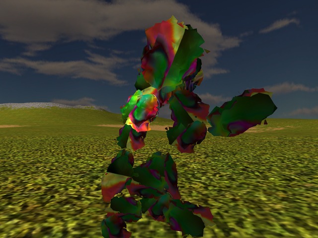
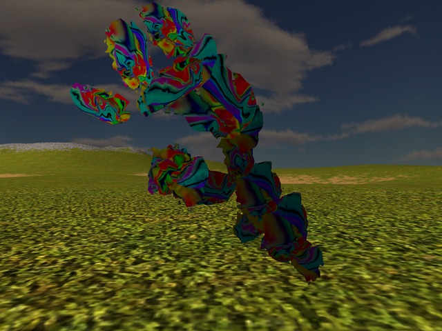
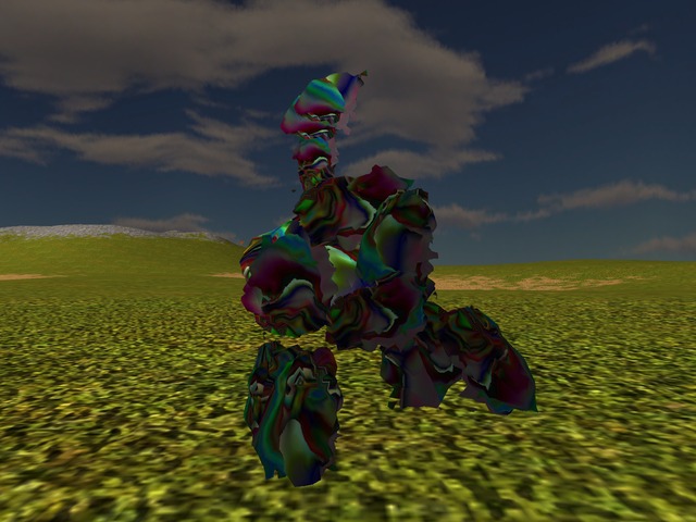
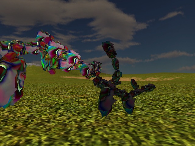
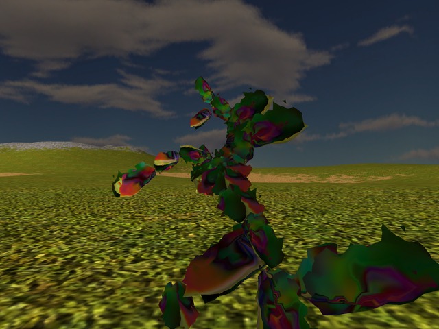
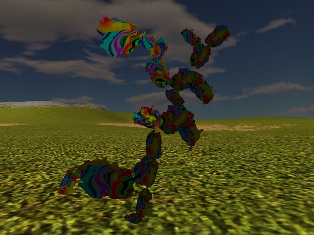
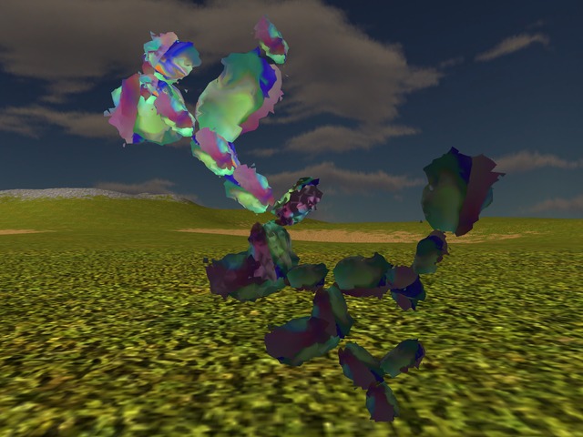
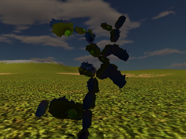
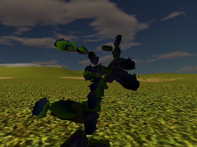
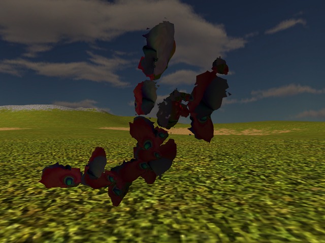
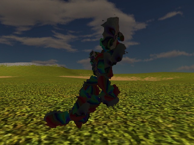
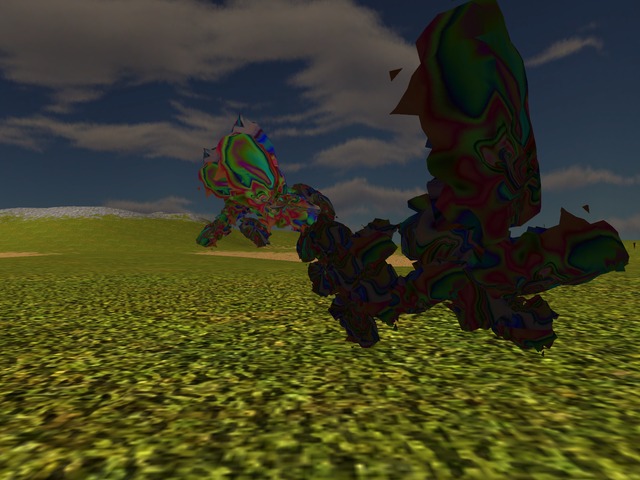
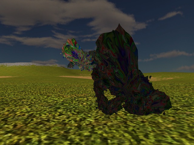
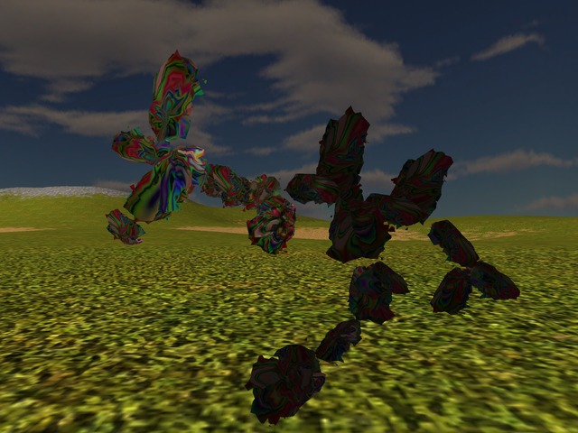
Finally and for completeness rather than for anything else, here's this article's fashion parade with yet another set of hopefuls wearing the above textures:
- Could it have *anything* to do with the fact that I have a *mountain* of stuff to write up? No, of course not, nothing at all, none, not possible.[↩]
- To... ahem, the complex plane: x and y are considered the re and im, while z is calculated as arctan(y/x), obviously; don't ask me why I had implemented this particular mapping, I just... had it implemented there from earlier attempts and so I used it now.[↩]
Comments feed: RSS 2.0
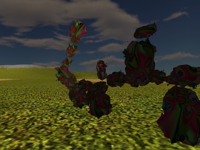
Lol, there's totally a guy there in the middle of the picture in the middle up top! He's cute, too!
And I'm glad to see this exercise is slowly edging towards the borders of my pareidolia.
tex_38_512.jpg is actually interesting, and imo the better in its set.
The pastels driven by the unit sphere projection are a radical improvement imo, please extract a bunch of examples in that direction so we add some more skins to the general hopeful genlib.
Looking now at tex_44_512.jpg, I can even make out a sort of cool horse/dragon/creature head on the bottom middle-right! And if I look at it longer, I start seeing all sorts for sure, so yeah, possibly better if I don't stare at them all that much, lol.
Noted re pastels - to be honest I personally don't like this particular colour scheme there but at any rate, I gather the big-bright-primary-colours are getting tiresome (and they are indeed, I had the other day a similar reaction). So I'll get some poking at the colours too while I do the next write-ups anyway.
[...] I left the generator code alone for a few days and did instead all the writing of textures and then some more writing and different code and new textures and even [...]
[...] http://ossasepia.com/2020/05/14/fashionable-hopefuls-impressionistically-naive-and-slightly-surreal/ << Ossa Sepia -- Fashionable Hopefuls: Impressionistically Naive and Slightly Surreal [...]