The swirly texture style clearly held some promise of both types of materials (e.g. metalic) and recognizable shapes of faces and eyes. So it was one of the first directions I explored further with my newly tidied up texture generation scripts that turned out in short order a whole... river of crazy eyes effectively flowing diagonally as you advance from one image to the next. The "flow" was rather expected, since the images are generated with a given offset that is applied to all three coordinates so that they are indeed pushed at the same time. The multitude of eyes and half-baked faces forming or half-forming and then dissolving again as the river flows was less expected but rather fun to watch. Here's a short sequence to illustrate how this works:
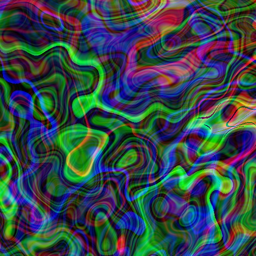
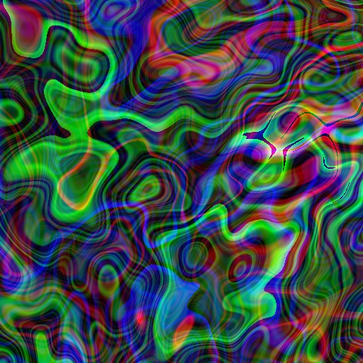
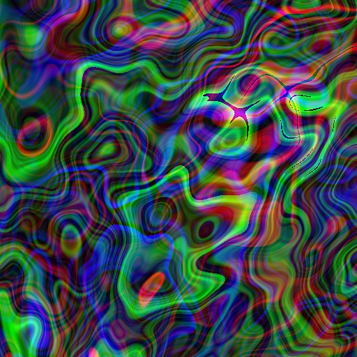
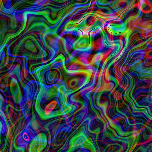
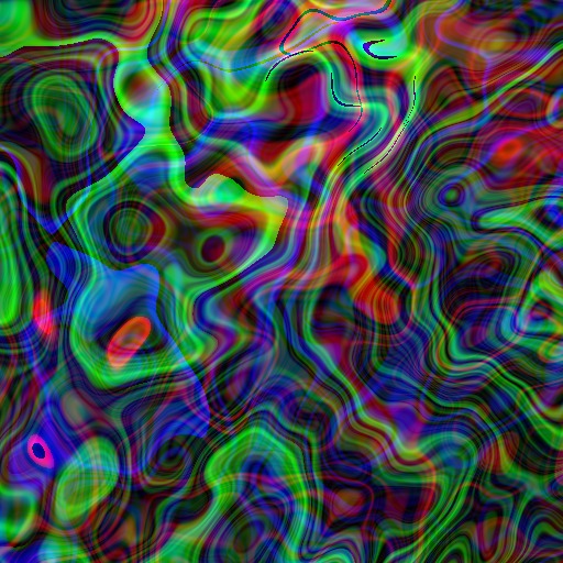
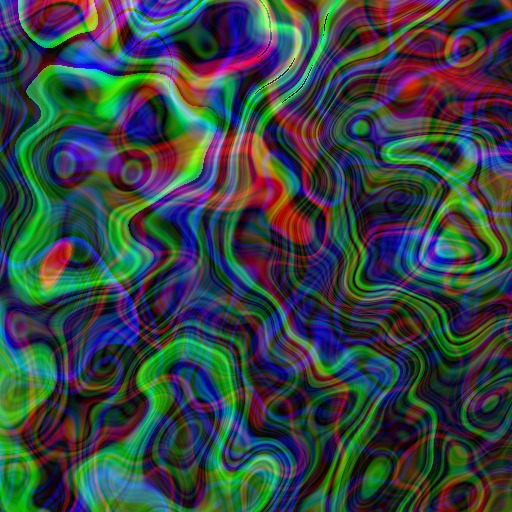
Given the obvious abundance of eyes and suggestive faces even in that river of textures, I was quite curious to see if one can indeed bring out some that may be even hidden under the surface. And it turns out - surprised? - that one actually can do even better - under the obvious face contour that is quite obvious at the very first glance, there is in fact quite an entirely different guy all sad for his lack of visibility - can you even spot him all hidden by the layers upon layers of fast-flowing features in this first picture?
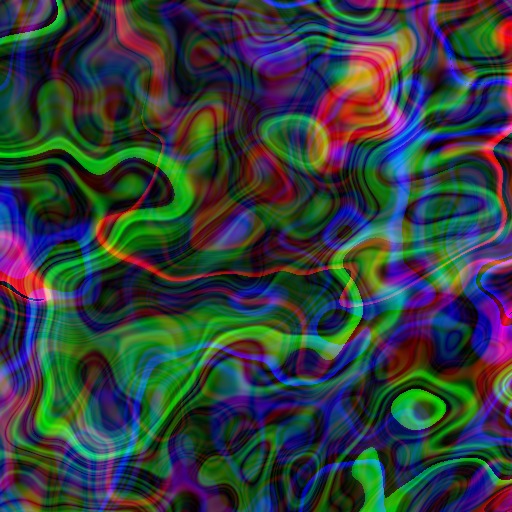
Once he gets space to be seen all on his own, he can even be further nudged to smile at you
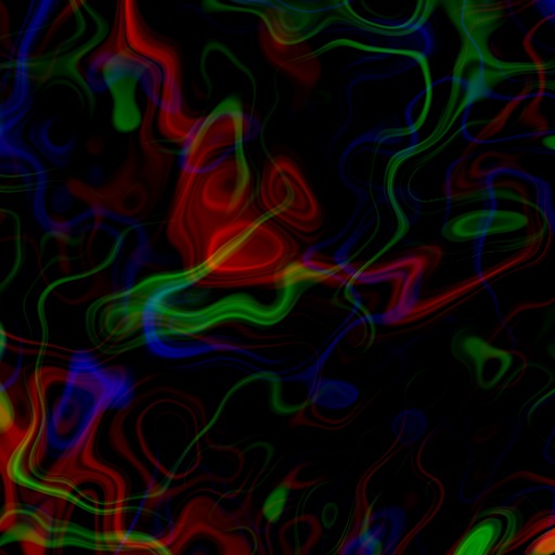
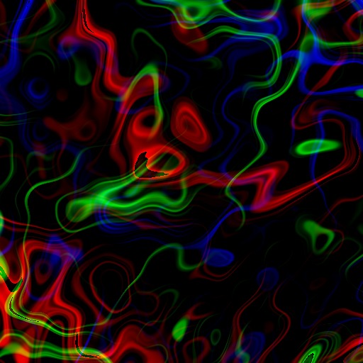
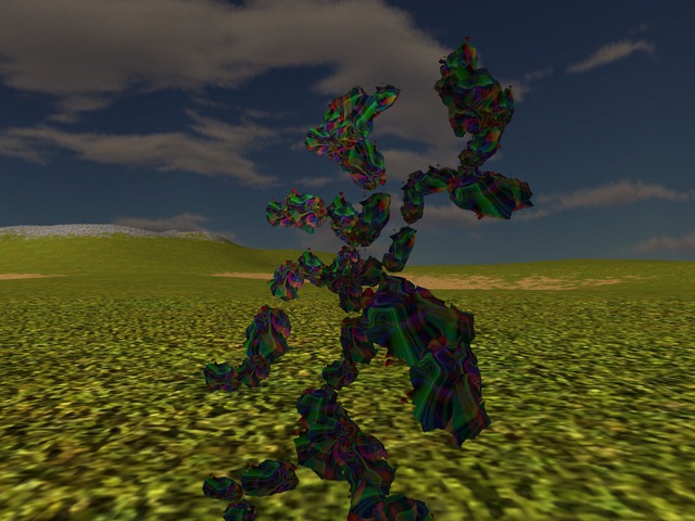
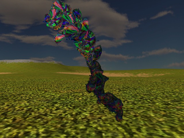
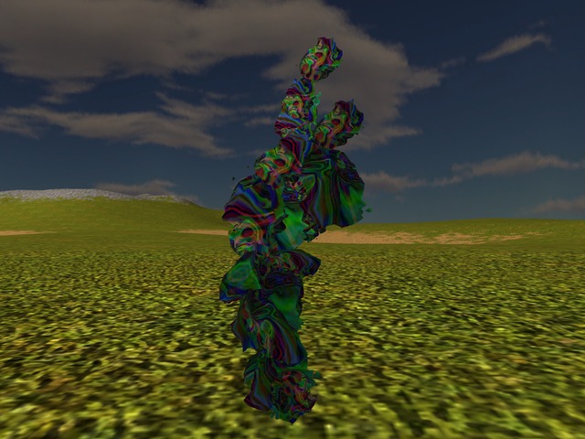
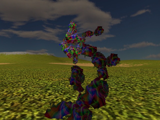
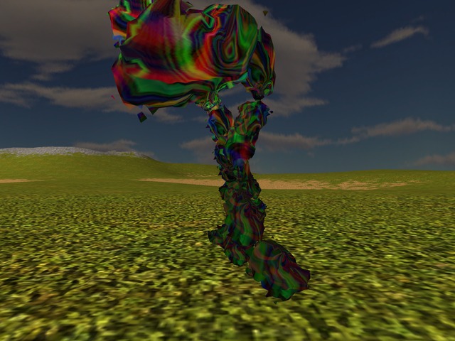
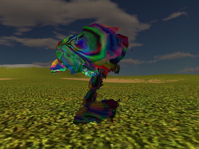
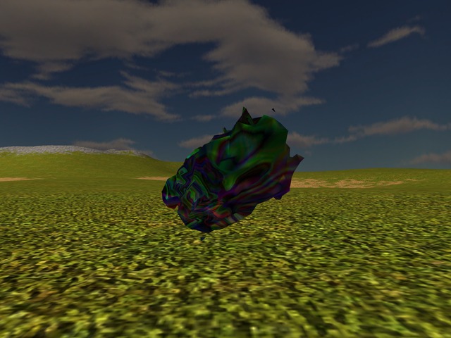
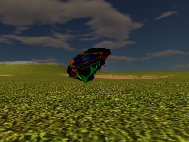
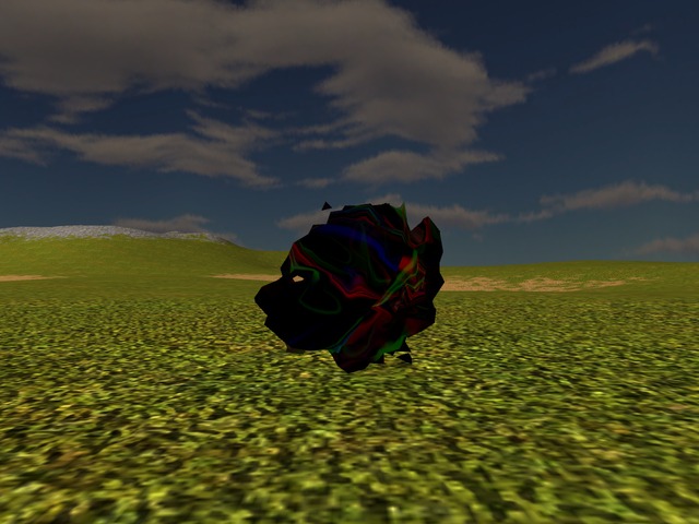
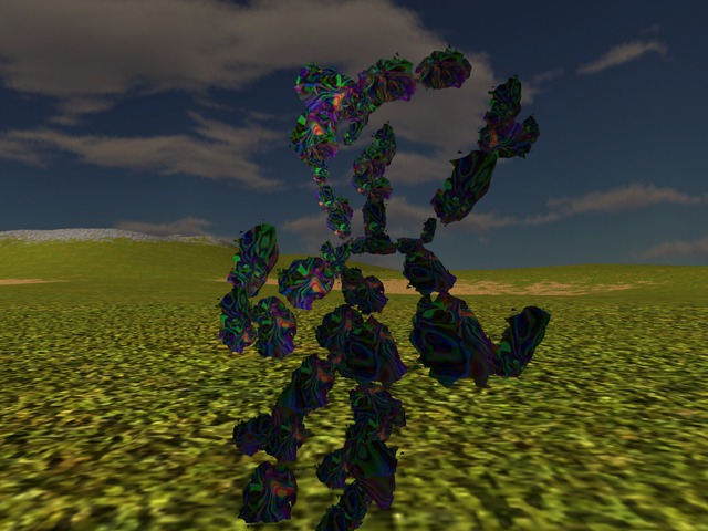
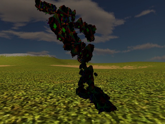
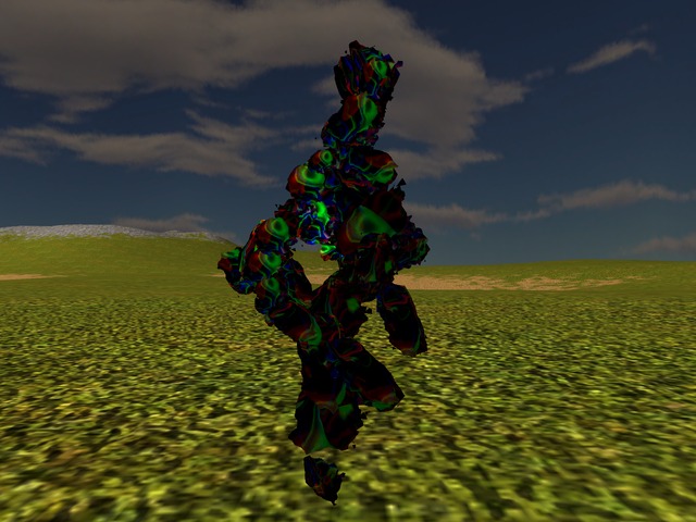
For all the coolness factor of that river of eyes from where this whole set of textures can be fished out and for all the fun factor of the textures themselves when seen as images on their own, their usefulness as skin covers for my hopefuls is rather dubious. Basically evaluating the fit of a texture has to take into account its match with the shape on which it will be painted and that's not an easy task: for one thing the shape so far is quite difficult to describe anyway, seeing how it's all fractally-deformed into all sorts; for another thing, the mapping of the texture to the shape makes it even less straightforward to directly figure out how the result will look like just by looking at the image shown plainly like this. In principle, the mapping currently in use wraps the texture around the shape - as the shape is not regular though, this round wrapping creates all sorts of effects and/or hides or distorts all sorts of features that are otherwise visible in the texture when seen as an image. As a result, whatever eyes or faces may be obvious in the texture itself, whether they show as such on a mesh or not is less clear upfront, as it can be seen in those shots of hopefuls wearing some textures from this set:
There is some little help that I can offer to someone trying to figure out this link between a texture image and the actual result when rendered on a hopeful: the whole trouble (and therefore potential solution too) stems from the repeated transformations between 2D and 3D domains. Starting from the texture generation itself, there's first a 2D to 3D transformation of the texture's own domain: the texture being a 2D image, it has only 2 dimensions that are called by convention u,v; as one iterates through the whole image to decide on a colour for each pixel, one has to make a first choice: is the texture to be considered 3D or 2D? If one sticks to 2D, things are more straightforward but there are of course more limitations as to the result itself. If one chooses 3D 1, one way to look at it is that the 2D texture itself is generated as if it were carved out of the corresponding 3D material - through whichever path/way this first mapping of the texture domain itself defines. Once this is done, there's a 2nd mapping in any case, this time to the 3D domain of colours. Finally, when used, there's a 3rd mapping that goes the opposite way, from the 2D domain of the texture to the 3D domain of the shape on which the texture is applied. (And then there are of course further mappings as the whole thing is rendered on a 2D screen, after all.)
The above is the basic thing behind my previous generation of stereographically mapped textures (aka their 2D representation is the mapping of a sphere in the 3D "material" domain) with the interesting part in the centre so that it maps then in turn neatly onto the "north pole" of the mesh too. In a way, this does mean though that the fit between a texture and a given mesh would naturally be best if and only if the 3D domain of the texture at generation time is taken to be exactly the mesh itself with all its irregularities and weird shape. Perhaps it's a direction worth exploring though at the moment I really can't tell. The downside to it would be that fitting them *that* closely literally means one has to generate a texture for *each* mesh. On the other hand, if meshes are anyway reused to stand in for many parts of a creature and if the whole generation is automated anyway, it might still be worth a try. Nevertheless, this doesn't solve otherwise the trouble of actually getting a pattern that one *wants* to see, anyway. That's a different matter entirely and a different exploration all in itself.
- For the record, all the textures I generated so far are in fact 3D textures, mainly because my implementation of noises and fractal transformations are 3D. I suppose I should at some point implement some 2D ones too, at least to be able to say that I explored that option too.[↩]
Comments feed: RSS 2.0
This actually looks pretty interesting.
The problems that I see are rather related to very strong contrasts especially in primary colors, but it's too vague a notion yet to warrant much discussion.
It seems there's no deep reason the texture generator can't have awareness of the geometric shape it's supposed to dress, indeed no very good reason besides happenstance and historical accident. I certainly don't think there's any money in some kinda purity, "the texture generator should produce textures in the abstract, universally and for all possible objects, which then must be painted upon the object at hand".
This might actually be easiest part to fix - it's basically entirely dependent on the colour mapping chosen. And it so happens that I have just implemented a colour spline mapping too though I didn't yet get to properly try it out :P
But yeah, I might need at some point the help of people who want to pick colour schemes to try out ie sets of colours that go together; the spline mapping provides then an interpolation (based on a cubic function) between those and the result should be smoother and certainly less "wild" in this sense of "very strong contrasts especially in primary colors".
The above being said, my play with yet-more-trigonometry yielded some interesting stuff in this respect too - now I still have to catch up with writing it all! (How did this even happen, I wasn't aware there was so much to write about, lolz).
Noted re awareness of shape at texture generation time. I think the mainstream kind of (in the usual wrong-end way) tries to do this to some extent through painting a model by hand and then "baking its texture" effectively stripping it and mapping it to a 2D image so that at rendering time the precise opposite mapping puts it back as it was initially painted.
> (How did this even happen, I wasn't aware there was so much to write about, lolz).
That's how this always goes!
Anyway, put it all out, that and the gym are the cornerstones of the feeling of wellbeing.
> so that at rendering time the precise opposite mapping puts it back as it was initially painted.
Yup, that's exactly what they do. The problem with it is that it manages to lock you into hand-painting tchotchkes that were supposedly computer-generated (ie, lose out on the immense and immensely cheap variety to gain a very flimsy semblance of "control over environment" and sense of self-importance). Whatevers.
[...] compare the above with the previous styles featured in this series (such as the Escher-like or the swirly river), you might get perhaps some idea that there are some specific choices made so as to obtain one [...]
[...] third and very long answer says at core that they'd be different in style (in the way for instance swirly textures make a clearly distinct group from Escher-type textures and both are still different from the [...]
[...] http://ossasepia.com/2020/05/13/fashionable-hopefuls-the-river-of-eyes/ << Ossa Sepia -- Fashionable Hopefuls: the River of Eyes [...]
[...] http://ossasepia.com/2020/05/13/fashionable-hopefuls-the-river-of-eyes/ << Ossa Sepia Eulora -- Fashionable Hopefuls: the River of Eyes [...]
[...] sets, from the signature rotate and shrink of chaotic systems to the clever diamond square and fm plus Perlin noise cheating shortcuts, there is always seemingly just out of reach - or at least out [...]