This week's work focused on the required additions regarding both skeleton generation and hopeful presentation: introducing symmetry (of sorts, given the collapsing of points otherwise) along one plane or along two perpendicular planes and then making the resulting hopefuls pose for the camera in 3 positions as well as trying on various skins. The result is that I had to leave it running during the night to generate all the screenshots for the first 50 skeleton seeds and the resulting pile of files is so huge that I'll just link it for download so as to not force everyone loading the page to load them all. After all, it's 50 skeleton seeds * 2 symmetry options (1 plane or both planes) * 3 poses * 11 textures, making 3300 screenshots and more than 1G total size to go through, just for this!
For future reference and for clarity otherwise, here's what I implemented/changed this week to the whole orchestra:
- Mirroring and collapsing of points: in the skeleton generation script, after obtaining the pseudo-random points both in the unit sphere and on its surface, I calculate the longest segment between 2 points and then the plane that contains that line as well as the origin (i.e. the centre of the unit sphere). While the original statement was a plane aligned parallel to the longest segment, some choice had to be made as to *which* plane exactly and the one going through the origin seems the most logical choice to me in this situation. At any rate, if it should be some *other* plane parallel to this, the equations are in the code and can be changed accordingly, not a huge deal. After this is done, all points are mirrored in this plane. If the 2nd plane is to be used as well, this 2nd plane is calculated to be perpendicular on the first and still containing that original longest segment. There was again a decision I had to make here as to *which* perpendicular plane - I considered that the idea was to use that original longest line as a sort of axis of symmetry, hence chose it as intersection of the two perpendicular planes. Once this 2nd plane is obtained, the *original* points (so NOT the ones already mirrored) are mirrored into this plane too 1. Then the average distance between any 2 points is calculated. Working always with closest 2 points, the algorithm will collapse them - replacing the 2 points with only one point that is exactly in the middle between the 2 (on all 3 directions). This collapsing is repeated until either 2/3 of the points (as counted immediately after the mirrorings) were collapsed this way or no pair of points is found to have the distance below the original average. Note that the average is not updated after collapsing points (as per previous requirements) but the collapsing is taking into account when finding the next pair of points for collapsing (i.e. with smallest distance between them).
- Centering the whole model in the originThe previous version of the skeleton generation script translated at the end the whole skeleton so that the resulting creature "stands on the ground" - meaning that the lowest y coordinate was guaranteed to be exactly 0. This helped when loading the model in Eulora's client, since that's roughly the client's expectation 2 but the client being what it is, it's of course entirely NOT worth it to play by its rules AT ALL and AT ANY TIME. (I'm shouting here at my future self, maybe I finally remember this upfront so as to not even try anymore at all.) As I needed to rotate the models around x, y and z axes, I discovered that there is no way to do that around the *model's own axes* so as to have it really just rotated but staying in place. The transformations that supposedly work to actually adjust the model's own coordinates are called "hard transforms" in cs parlance but they turn out to be ...not available for Cal3d models! And otherwise getting the transformation "from world coordinates to model coordinates" and piling there translation, rotation and back translation to achieve the same thing is an exercise in maximum frustration because there's no reliable way to get the *exact* centre point of a loaded model (so as to translate it to make sure that it's a rotation around that point basically as opposed to some ever-so-slightly off-centre point that will throw the rotated model all over the place). Having tried ~everything to make do with what the client offers on this, I got not only all the experience I never wanted with all the different ways to attempt this at the intersection between CS, Cal3d and PS but also additional insight into client's idiotic behaviour. Basically the PS approach to "we required models on ground for convenience and this fucks rotations around anything other than y axis because it will go all over the place" is to "oh, it's fine, we can therefore fuck also rotations - we won't do any other than around y axis". Moreover, I found out that when "looking at" something, the client as it is now ignores the y coordinate because otherwise it's not made well enough to tilt the creature's *head* as opposed to the whole body - so if the thing you are trying to look at is taller/higher up than your character, you end up looking at their feet or something, not at all at the point you thought you'd look at; if, on the other hand, you force the proper "look at", your character gets tilted and basically can't walk properly anymore. Those wonderful findings aside - and under a pile of assorted cussings - the sane solution is therefore to simply centre the model in its own origin *outside* of the bloody client and then let the client work with that, as it can. For the task at hand, this went then (finally!) as it should have gone from the start - quick and easy, rotations work as they should, the thing stays in place and given that its maximum size is anyway known to be 2 at most (remember that unit sphere), it's enough to render the whole thing a bit higher off the ground and force that cally to stare exactly at it, tilted if she can't in any other way. Obviously, this also meant bypassing all the PS cruft and using directly CS methods for ~everything involved.
- Pose parameter for client - the smallest change to the client's code that I could see so that I can show properly the hopeful in the desired poses was to add a command line parameter indicating the pose (by number). Based on that, the hopeful will then be rotated (or not) and shown at the same place. Basically this change was minimal and works perfectly fine for the purpose.
- Updated overall script: since every hopeful is to be shown in several poses and wearing several textures, I updated the controlling script that runs the whole orchestra so that it has 2 additional loops to go through after generating each and every hopeful - the first loop iterates through the poses (so only 1 to 3 for now, but easily extended otherwise); the second loop goes through all available textures (assuming they are conveniently called tex_1.png and so on), copies the current one to where the client expects the "default texture" and then fires up the client to take the screenshot. Obviously, the names used for the screenshots now carry all this information too, to keep them reasonably ordered otherwise.
Other than the above changes, the rest of the time went more into struggling with the client's various idiocies so it gets counted at "experience earned" rather than anything else. One thing that starts getting annoying too is that the client "saves resources" by refusing to render if its window looses focus - while this might be ok when playing the game, it starts getting on my nerves when just rendering hopefuls since it effectively means that the machine can't be used for something else at the same time. At any rate, if it gets truly annoying, I'll probably just hunt for that bit of "saving" and comment it out for now, but so far I didn't spend the time on this. There are still the ideas and things I wanted to implement from last week but didn't get around to - as I focused on adding the symmetry and then fighting with the uncooperative client.
As to the results themselves, here are first of all the 11 textures that each hopeful in this round tries on:
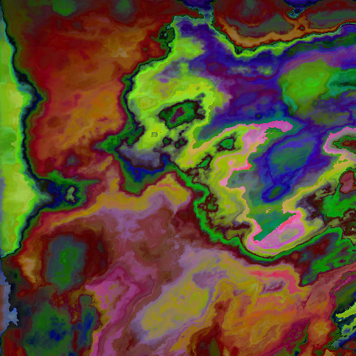
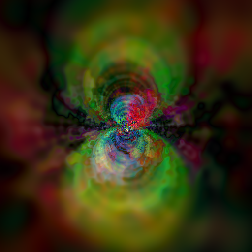

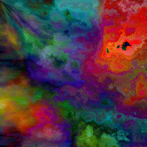
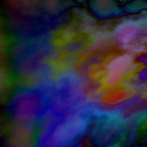
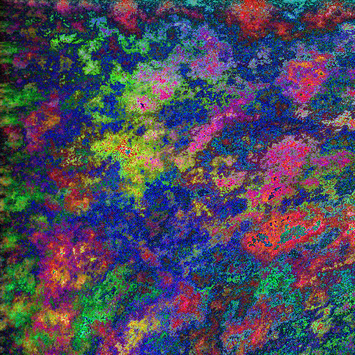
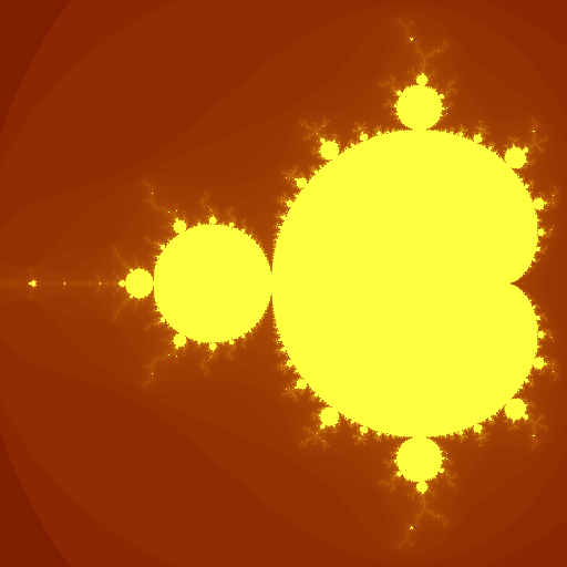
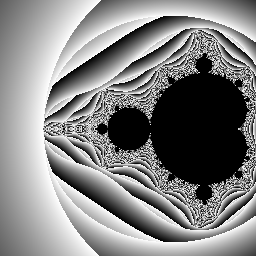
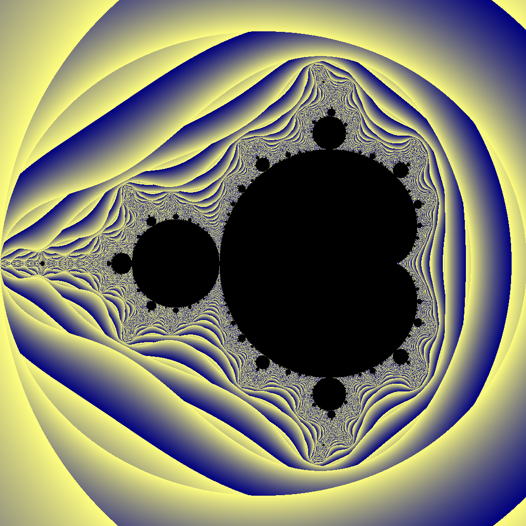
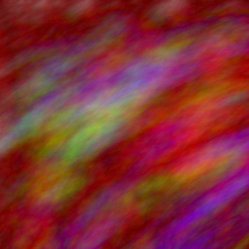
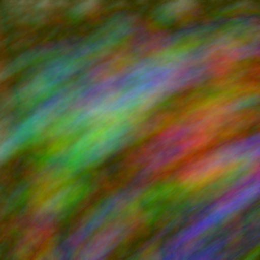
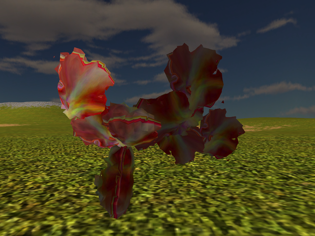
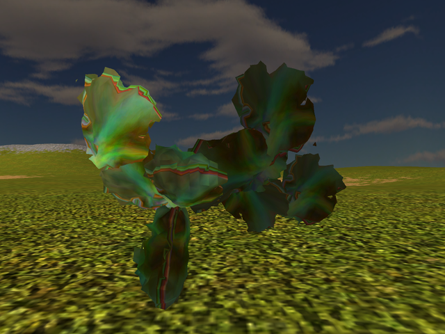
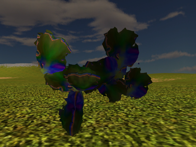
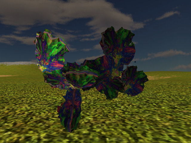
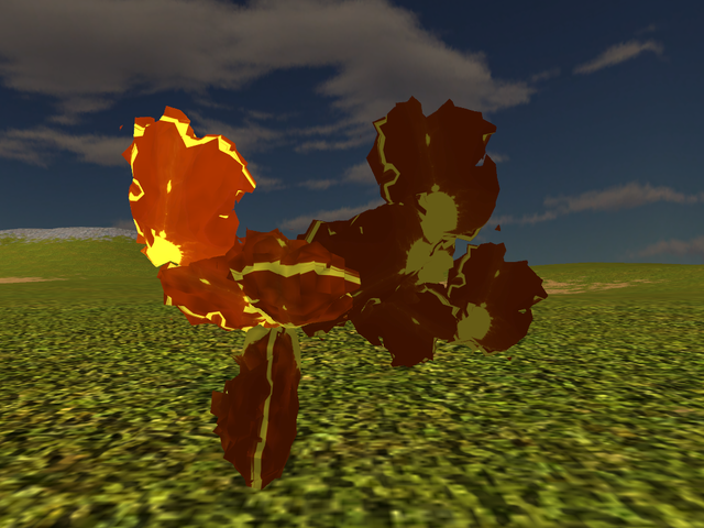
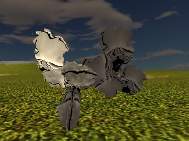
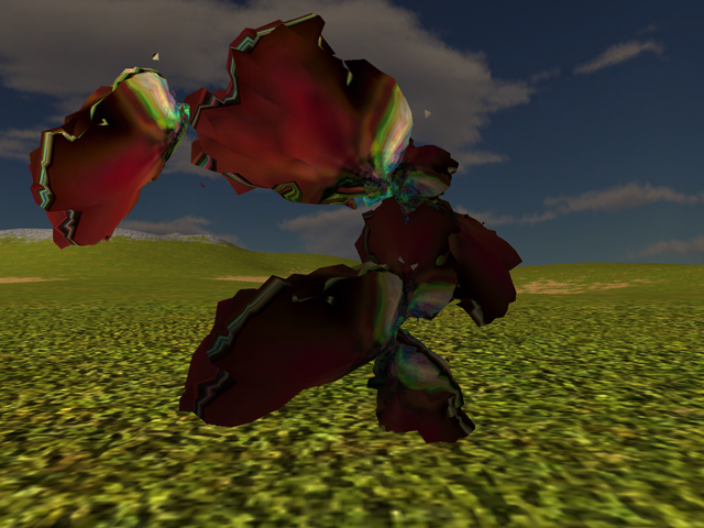
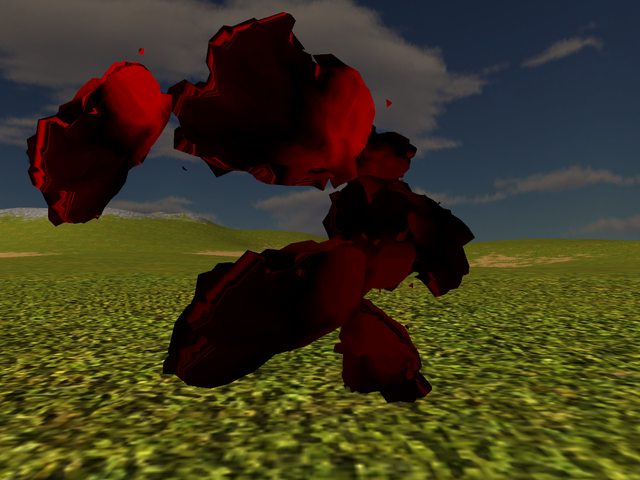
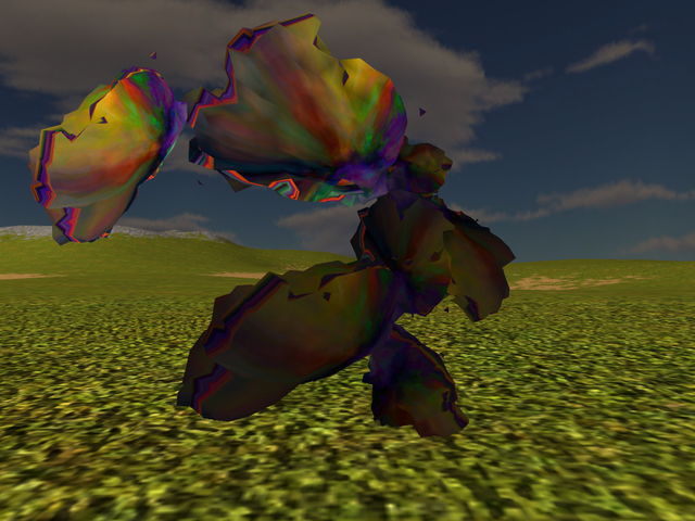
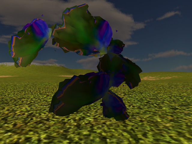
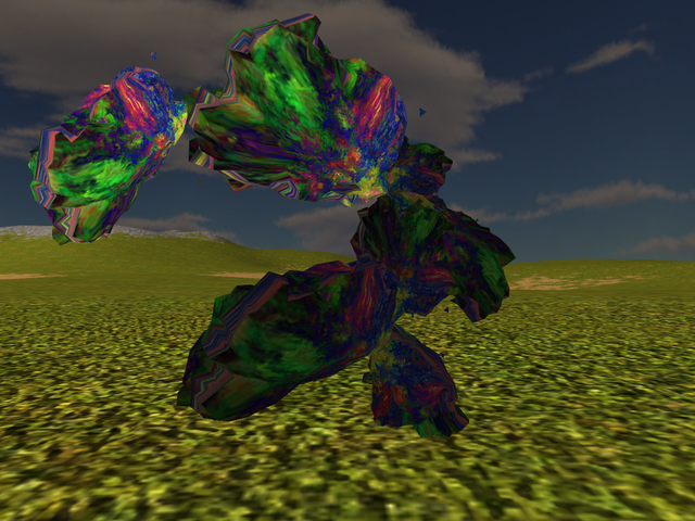
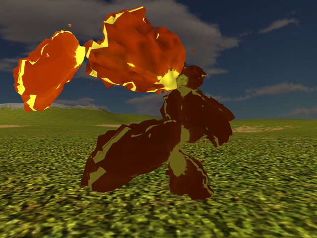
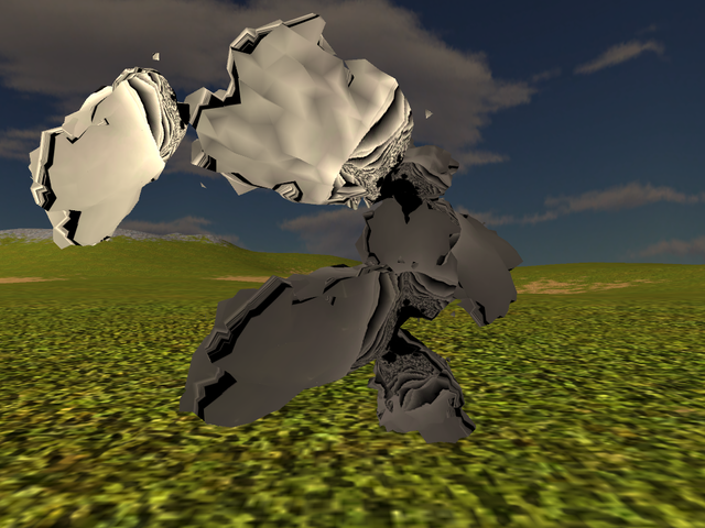
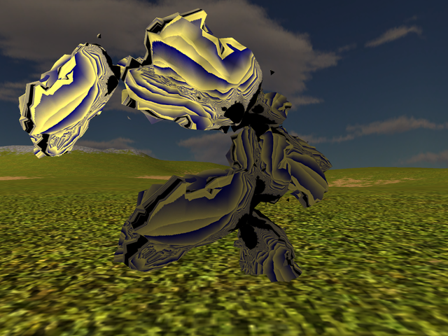
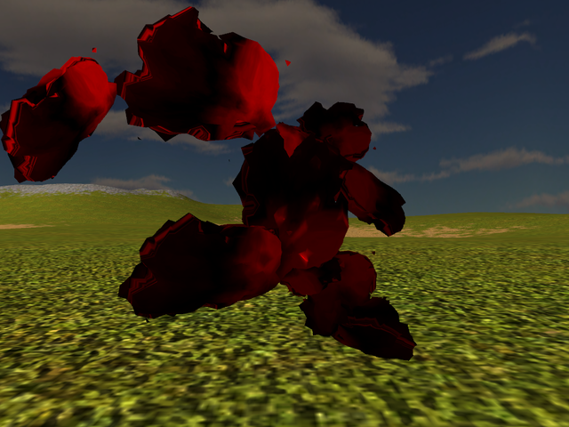
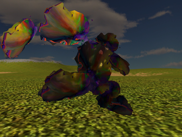
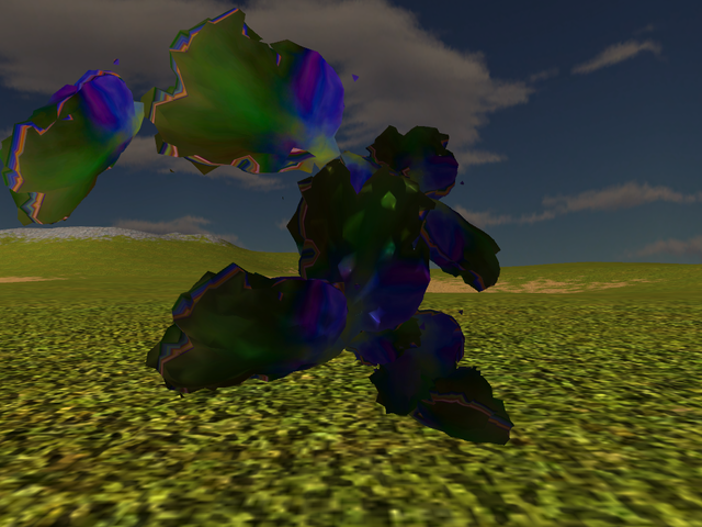
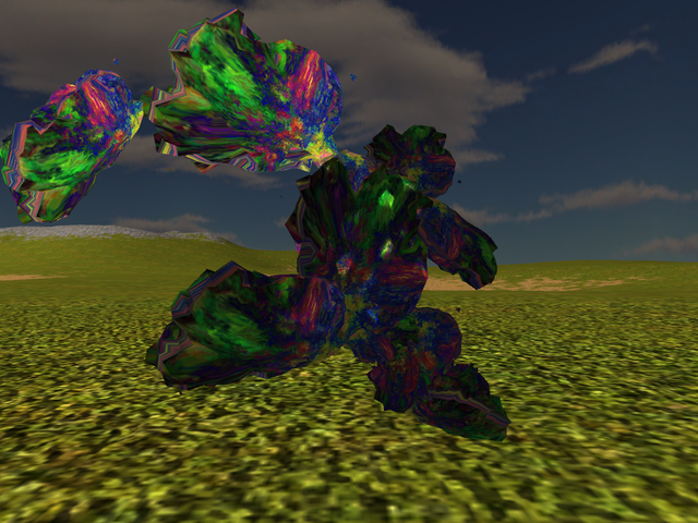
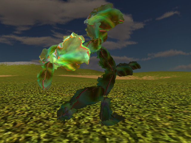
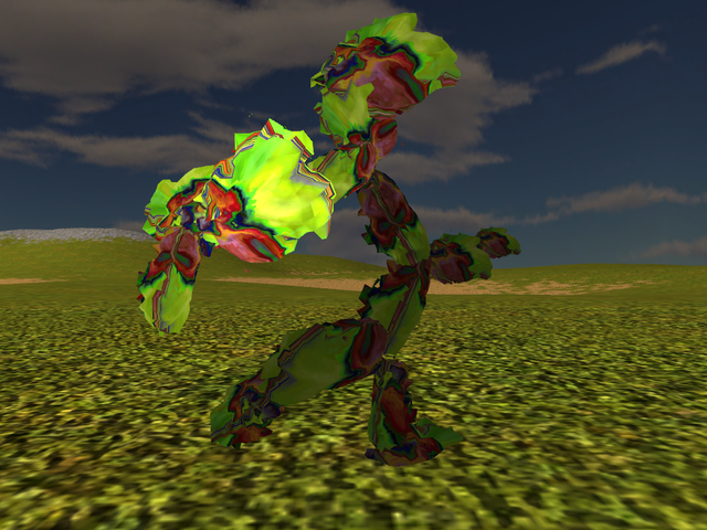
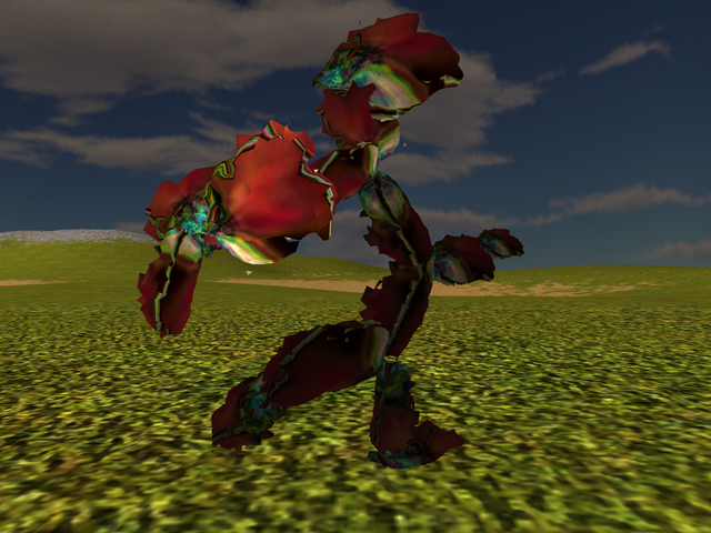
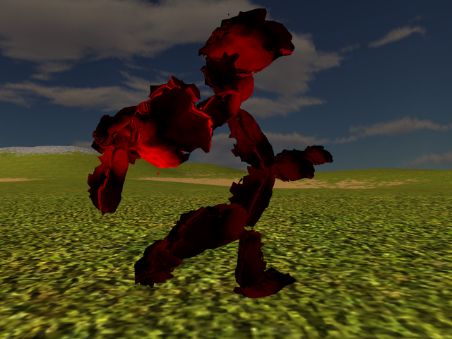
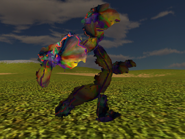
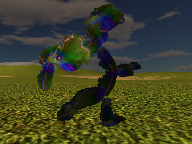
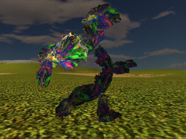
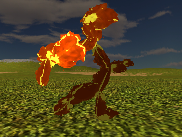
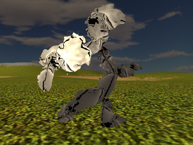
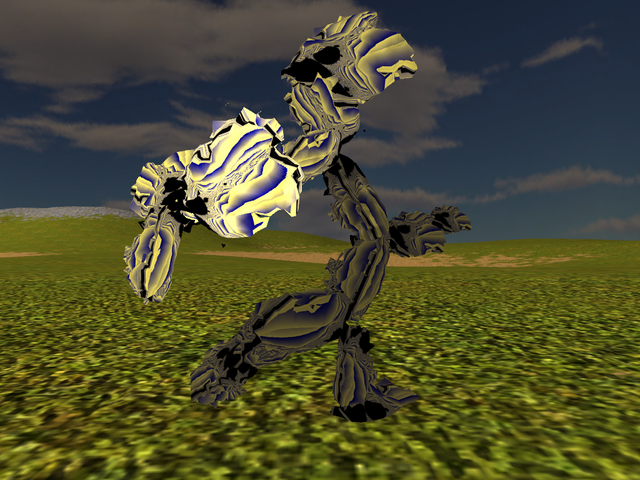
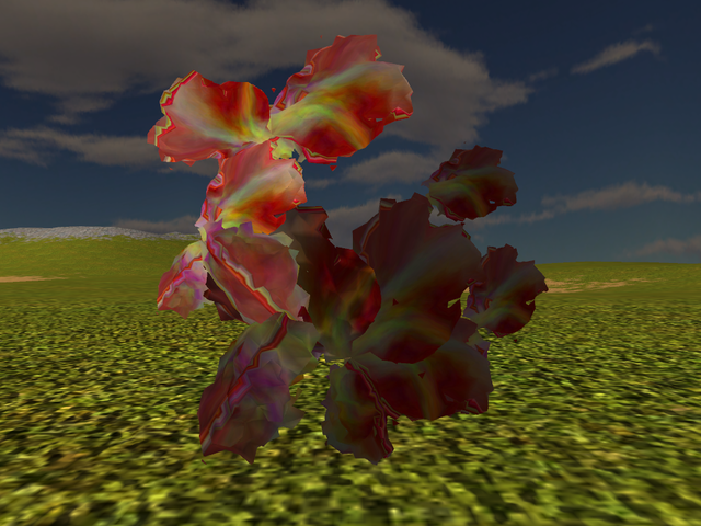
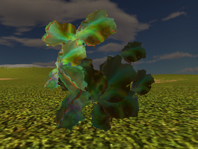
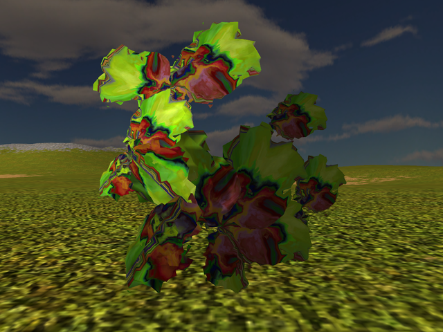
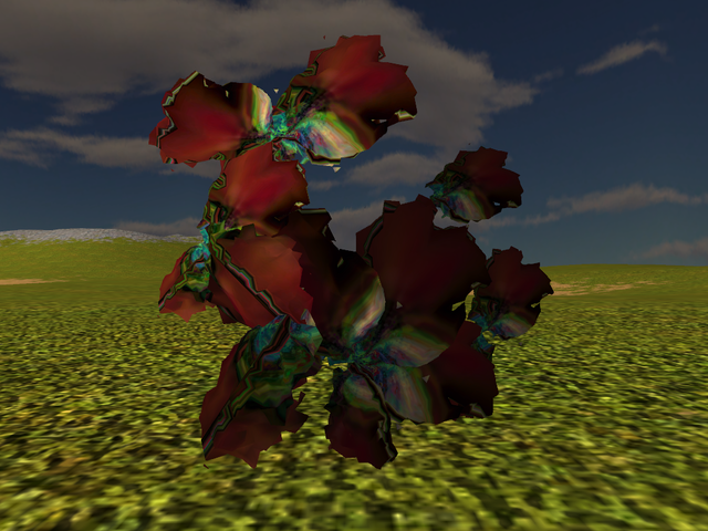
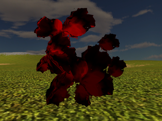
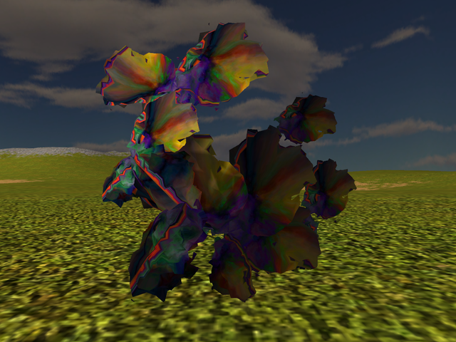
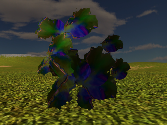
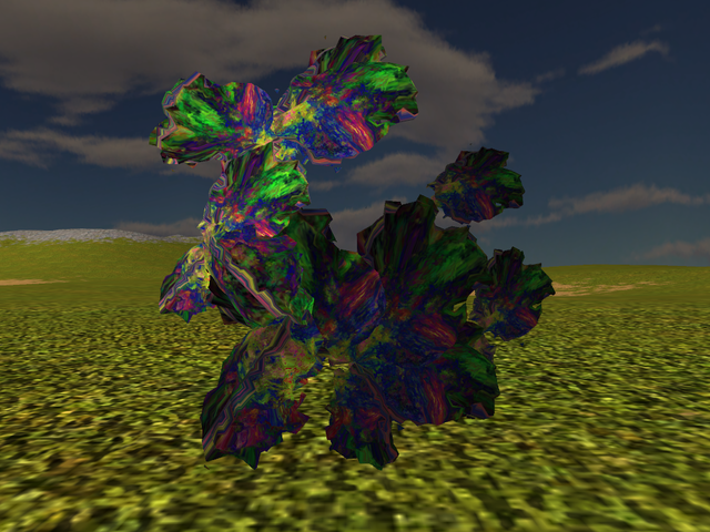
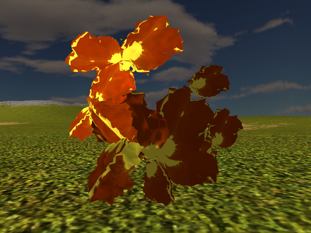
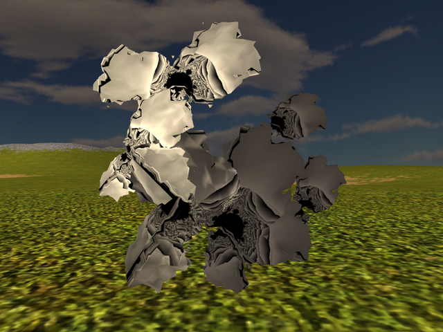
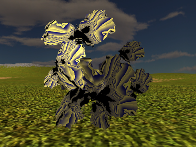
The full set of screenshots is available directly here with filenames including the seed used for the skeleton, the number of symmetry planes (1 or 2), the texture number (see above the set of textures, if you want to find some specific one) and the number of the pose (pose 1 is without any rotation so as generated; pose 2 is a rotation of 90 degress along x, y and z axes; pose 3 is a rotation of 135 degrees around x,y and z axes). All the hopefuls this time start with points in the sphere between 3 and 5, points on the surface between 5 and 13, so you can compare them with the previous run with those same parameters before introducing symmetry. Finally, here are a few shots shown here too, for those that simply want to load this page and not go otherwise through all the 3k+ pictures:
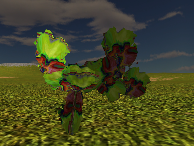
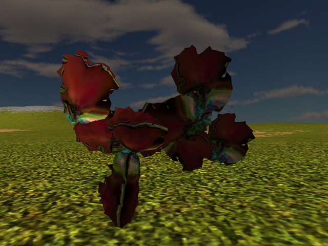
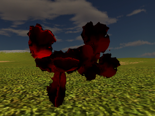
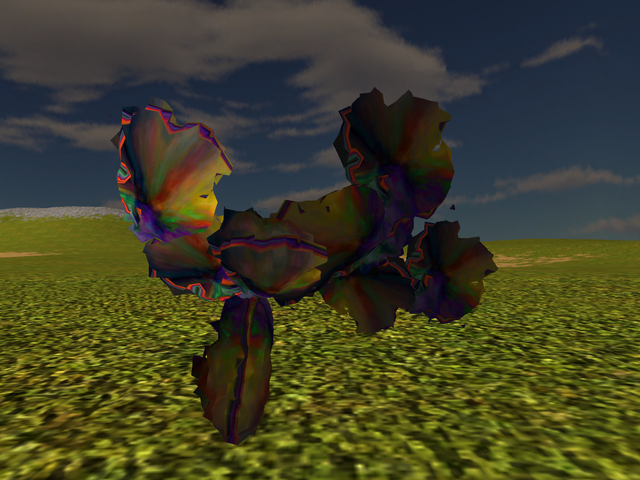
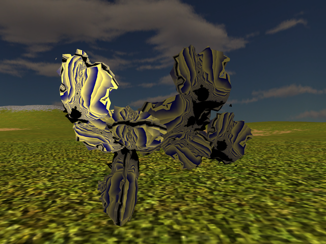
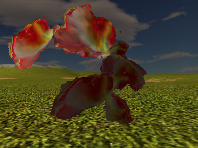
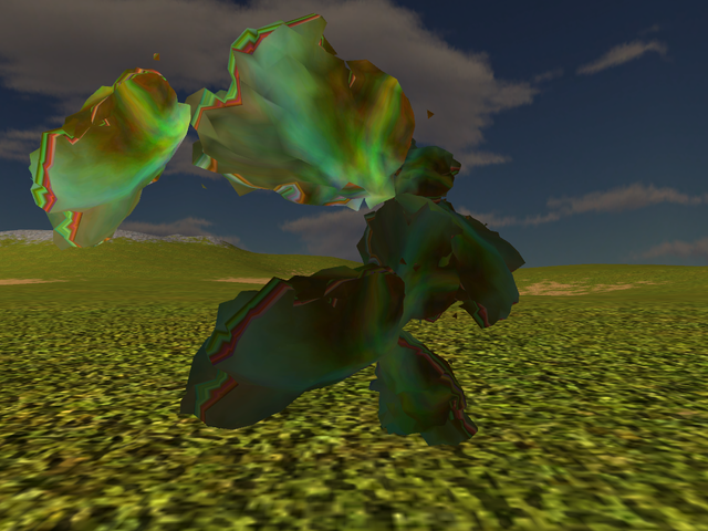
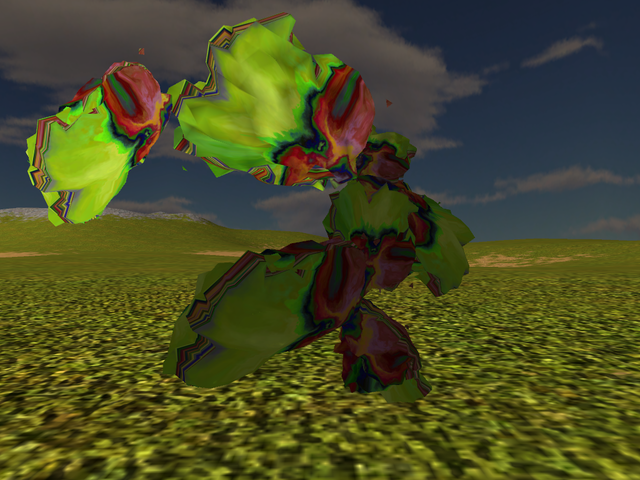
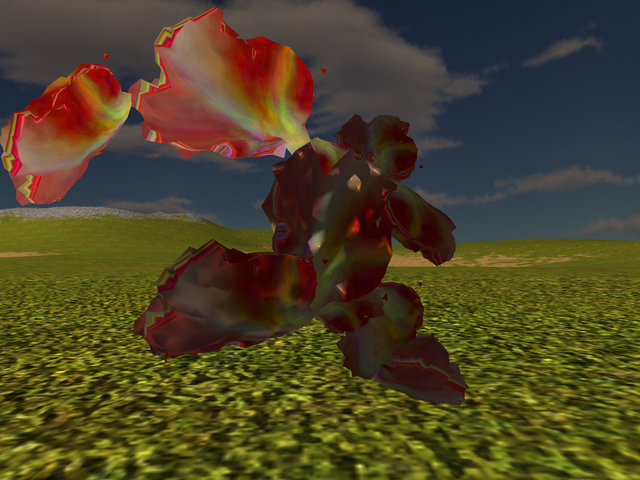
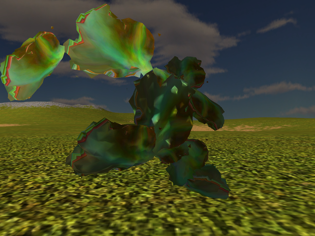
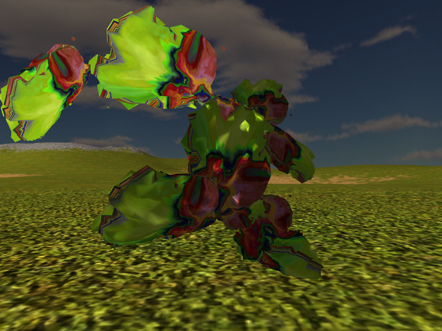
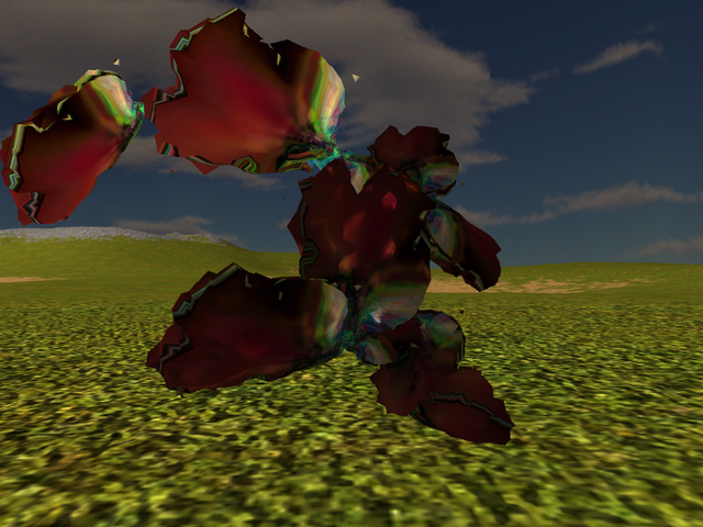
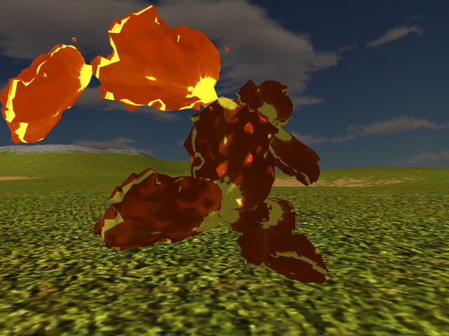
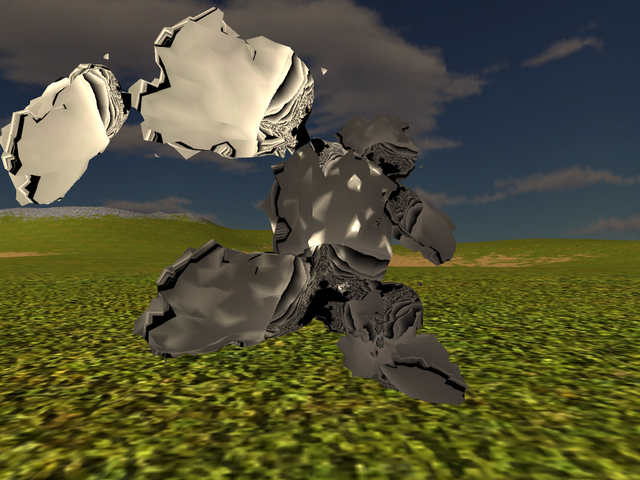
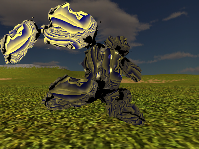
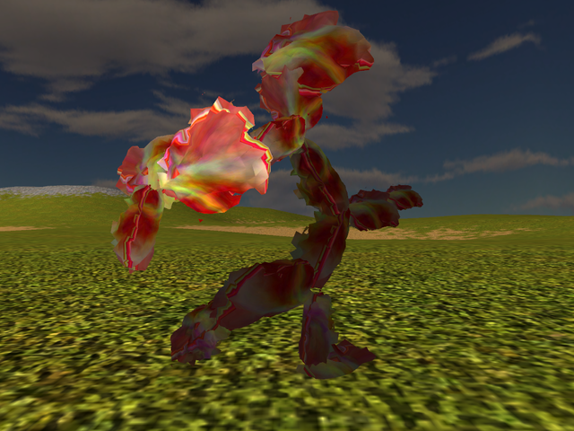
- I interpreted it this way because of the collapsing of "between 1/3 and 2/3" of the points - basically the 2 mirrorings applied to the original points only triple the total so collapsing that many at the end makes some sense. Again, if it was something else specifically wanted here, it's quite easy to adjust - if anything, it's the rendering and screenshooting that takes significantly longer than any number fiddling.[↩]
- Roughly, because otherwise and in the infuriatingly idiotic style known by now as PS signature approach, there is further a "leg length" defined for each "race" so as to adjust afterwards this on ground ever so here-and-there-just-to-make-something-to-do.[↩]
Comments feed: RSS 2.0
Believe it or not I did go through all that (if you're curious, wget --recursive --no-parent -e robots=off http://ossasepia.com/wp-content/uploads/2020/04/hopefuls3/ sucked them in locally, after which I had a nice slideshow). It's ok to delete the pile in /hopefuls3 now if you want to conserve space.
On the narrow technical front, 35-1-2 is missing (and 1 looks like it had a problem) ; 35-1-10 missing also. I don't miss them per se, but maybe you want to look into what caused it. Also, mind making the pics 1280px wide rather than the current 640 ?
I'd say skell29-2 is probably better, followed by skell12-2, skell7, skel10, skel4, skell8, skel1. On what I've seen it does seem to me sym1 is more reliably ok-ish, whereas sym2 generally shittier but also generally the one that pushes out the best results.
Textures 8 and 9 suck, please take them out altogether. Also, let's use the texture shots to get more angles in. Currently it's showing the same model from the same 3 angles for each texture ; suppose instead each new texture introduces a random rotation around each axis ? That way we'll get to see the models from as many angles as there's textures, which renders the 3-angles-per-model thing superfluous.
I want this changed so that the third point defining the plane is the generated point that's closest to both selected points, instead of the origin.
I want this changed such that both original and mirrored points are mirrored again by the 2nd plane.
Keks.
"The client" being, of course, a microcosm of the pantsuitism that created it ; which is why real people don't "quarantine".
Win-win, as they say :D
Yeah, put that in.
Can we re-do this with specifically 7/7 ; 7/17; 11/5 ; 11/23 ; 29/37 ; 51/53 ; 53/29 ; 57/119 points in sphere/on surface ?
Excellent work, btw. We often do this harem activity whereby we look through the reel of pictures from some outing or other activity ; but this time around we spent a pleasant hour looking at migraine auras -- and everyone's quite looking forward to the next installment!
Thanks for pointing them out. Yeah, that's what happens when the client's window loses focus/gets messed up. I missed those somehow in the pile but I'll check it properly at the end next time. (And I strongly suspect I'll kill that idiotic "saving" anyway because I'll be damned if I stand for the client taking over my machine now.)
Lol, only taking even more space but otherwise 0 problem. I'll make the next dump the bigger size then, sure.
It's not that surprising really but yeah, it confirms to me that we really have different orderings of preference where it comes to looks, heh. Anyways, the list overall seems to tend to ~same so at least there is some sync there. And at any rate, given how many of those I end up seeing by the time I publish a dump, I genuinely prefer it if someone else does the pick and choose because I'd need a break to be able to see them on their own rather than with all the loaded visual context.
This is exactly what I think of sym1 vs sym2 as well indeed. Then again, it possibly also depends on number of points and all that, so we'll see later on, I guess.
To my mind most of direct Mandelbrot representations are not that great as textures (but you said initially "Mandelbrot"!!!11) and otherwise I didn't really go into all the zooming in and fiddling with the colour mappings that could end up conceivably with other pretty - if rather obviously regular - images. Anyways, I'll take 8 and 9 out - do you still want 10? Also - do you want added any/which of the new ones from the latest fashion show?
Yes, why not. (And lol - I was pretty sure I'll need to add the angle and axes as parameters to the client instead of just a pose number, to keep the same pose for one texture across different hopefuls).
All right, I'll change it that way. (Let there be NO formula-simplifying assumption!!! Heh.)
Easily done, on the list it goes.
Certainly. There will be of course 8 times more shots than in this set but there's not much way around that for sure.
Thank you and very glad to hear everyone enjoyed my still-messed-up hopefuls!
I'll compile the full list of changes to do from the above and get that in first, after which I still hope to find the time to try out some changes to generating the mesh as well. There's a pile of reading I still think would be useful to get in but apparently on the reading front for this I need a break & more experimenting for a while.
Regarding the pics, I'll probably leave on the server only those included in the article and delete the rest, especially when the next set is ready.
Added question as I forgot: do you still want that "seam" artefact from texture mapping? I'd rather switch to the latest and not have that in anymore.
O yeah, definitely. Teamwork, that's what it's even supposed to be in the first place. Not that ~anyone under the sea of where used to be our garden even remembers nowadays, but yeah, don't worry too much about sorting them. Just make them, I'll sort them out with my flaming sword later.
Multe bat la poarta vietii...
Speaking of which, your blog interface is mildly infuriating ; I was looking earlier for something and boy howdy, I can't find anything in here. Could the archive pages NOT be paged, for one thing ? It makes a world of difference if I can grep over the whole of 2020 say, rather than have to hack urls, guess "whichth page it prolly is on" etc.
I also notice your articles don't link their category anywhere on the page ? Dunno if this is deliberate or not but perhaps worth the mention that it's the fundamental thing a category even is : that symbol which is referenced by each individual item it supposedly includes (ie, what latter was called a "hashtag" most barbarically). The "category listing" (ie, reverse lookup list, showing all the items linking to the object in a list) is a latter adition, and a functional development of the category, not its onotlogical enactment (as the #ha$ht4g crowd might mistakenly believe on the same supperficial basis they form all the rest of their beliefs). In other words, it's not even logically possible to have such a thing as a category if the categorized items don't reference the categorical node.
Finally, could the #log autoarticles perhaps not figure in the "latest articles" list ? This may be just my newfound disinterest in the comings and goings of the "engineering" simps&cucks talking ; but on a very narrow horizon it'd seem the direct cause of "holy shit can't find anything on diana's site anymore". Even from a political perspective, do you actually want your own writing overwhelmed 10:1 or more by volumes of... whatever it is, I ain't reading it ?
The list originally read 8, 9, 10, then I took 10 out. Whatever, I'm waffling on the topic, let it be for now, not like we can't wipe it later anyways.
Yes definitely, like I say there... fuck, my comment got eaten!
Brb reinstating it.
So, yeah : 1, 4, 13, 14. And yes I'm very open to more proposals in that vein, by all means, play with pretty colors whenever you feel like.
See, sometimes the workorders end up simplifying rather than complexifying out of sanity. Besides, with this 1/3 reduction the 4x factor above from the pic sizes should almost disappear (it'd have probably actually disappeared given the texture removal ; but then you had to go fashion designing -- in other words, you did it to yourself!)
What can you do.
Just to be sure we understand each other, 7/7 means models with specifically 7 points inside, 7 points outside, yes.
By all means.
Nah.
Actually, given that we'll be doing the dump thing, how about fewer pics in articles also ? I don't mean to cramp your style, but every time I comment it reloads 100+ pics...
Maybe also set your ttl / cache content web thingy whatever it is.
Huh? They do, in that meta bit under the text - "filed under" bla and bla. So not sure what do you mean if that's not enough. Re the archive pages remember I already hacked them one because they were showing full abstracts, what can I say.
Myeah, this I was pondering myself the other day. In between "fuck, if I talk in there, I want it at least on my blog too" and "ugh, now there's a ton of those", I am still thinking what to do exactly about it. Tbh I think I'll even keep it as a one-month long article at that, no need for all this daily-new article, hm. For that matter there's #eulora logs too - I think it is worth preserving the historical logs at the very least although for the moment there's probably no need to keep logging the chan. I'll give all this a think and clean it up over the next few days at most.
For all the theme otherwise and full interface and whatnot - basically I used to have my own theme that had all this in place back when I used whatever WP and then switched to the MPWP that didn't play nicely with my theme so ported over minimal because never had the time to dig and now ugh. I suppose there's no way around this and I'll have to sink a few more days into all this and get to the bottom of it once and for all but I admit it's mildly infuriating.
Heh, there's even more than *just* colours I want to play with, there! Since all this computer graphics is anyway an exercise in cheating the eye, it makes sense to at least try more serious cheating as well - not all volume/surface needs to be for real, some of it might come better off from futzing about with the ...normals, apparently. Still need to try it out at the very least.
Yes and no problem at all. Parameters ftw (the way it's now, there's min and there's max, with a roll of dice in between; so can simply set min the same as max and that means...fixed, it's literally tweak a number and run).
Eh, common, it's the previous parade the really heavy stuff! This has teeeny tiny set of pics by comparison! (But yeah, it was the experience with parade 2 that got me throwing my hands up at it and going - dump rather than article; so I'll keep the images in article to a ...smaller number; at least I'll try to.)
A damn, right you are, I somehow managed to scan the page up and down three times looking for it and still didn't notice it.
That may well be the best solution, a coupla mb per page is standard webfare these days anyways, at least yours will be textual content.
You know how it is, as you spend more time at your house it starts getting new coats of paint and things.
Yup, perfect.
Come to think of it, this is quite so. I guess I hadn't yet quite realised just how much more time I spend on own blog but yes, I'll have to do some more work around it, clearly.
At any rate, I've switched the bot to monthly log-articles and I've trimmed the pics here and kept only one pose for each so hopefully that's more reasonable at loading time too.
Definitely!
I got in the changes you asked for, here's the list for checking before starting the screenshot runs:
1. first plane is defined by the 2 points furthest apart from one another + the one point that is closest to those 2; I took "closest to those 2" to mean "sum of distances from candidate to point 1 and to point 2 is minimum", let me know if it's something else you had in mind;
2. ALL points (original as well as those reflected in the 1st plane) are reflected in the 2nd plane (so total ends up 4 times the original number but then the collapsing drops up to 3/4 of this total and usually it seems to drop indeed that many);
3. took out textures 8 and 9 (mandelbrot grays & mandelbrot blue+yellow);
4. added textures 1,4,13,14 from new set so the total textures now is 13;
5. replaced fixed pose with a rotation by a prng-number of degrees (around all three axes) using texture's number as seed (so that each texture has its own); this is shown in the file's name too, for easy ref;
6. client's window is made bigger so that the screenshot is 1280px wide to start with so the detail is there;
7. the fix to remove that seam from the texture mapping is in as well (though now I have ofc yet another idea that I'll need to try out too!).
It would seem that the changes to the planes & reflection tends to make them "narrower" but anyways, new question here - do you want the same skeleton seeds 1 to 50 or different ones to try out and see what they give?
Different ones ; otherwise this is all good.
Cool, I'll have it running over the night and see what gets - at any rate, there should be a new dump by Friday the latest. I did a few tests and on the 57/119 it can get a *lot* of bones, for all the lulz.