Until such time that you make any buttons of your own at least, it's now all settled, clear and without a choice: on all Euloran soil, it will really be my buttons you'll have to push 1 and my views you'll have to use and my winPAWS 2 that you'll look at. For there was/is barely anything useful in all those 100 windows that were each terribly important on their own, each with their own layout xml file and own hand-rolled loader and own parser and own further numerous attendant misfortunes that are inevitably linked back to that mighty struggle of trying to have a singleton manager without admitting however of having any *specific* manager. It's a riot reading the code and the famous "software patterns" and even all the Object Oriented paradigm in this obvious key. It's even funnier now as the end of the swamps is otherwise in sight and as the intelligent idiots are out of my way and staying there in their narrowly delimited circle where they are taking over the world, I'm certain, only it's each of them/span>m taking over their own world but that tiny detail is entirely unimportant and can't possibly matter, can it? They are after all solving problems with code and moreover solving "problems" picked and ranked based first and foremost on what they are familiar with and the sort of solving that they have done before since that has to be the best way - the more independent, upright, sane and intelligent way. Not that this has anything to do with it being also the only way that is still in the least open to them, no, absolutely not.
Back to that fast growing life of Eulora, the dive into the full depths of PAWS was essentially successful if not lacking in crashing, segfaulting and downright maddening experiences: the whole thing is not unlike a carefully constructed castle of sticks that stands for as long as it's untouched and then unravels entirely at the merest movement of air around it. There is in fact already a set of "basic" elements and those 100+ windows are on top of that but even those "basic" ones are at times anything but basic. The most screaming out loud example of this would be the humble title of a window/widget/whathaveyou - in order to show *any* title (as in text, a few letters, nothing more), the "widgets" require a border and that requires buttons and styles among other things and those in turn require preferences and all sorts that further require the requirements of requiring required requirings... Why does the title part require buttons or borders or all that? I suspect it's because someone was solving there with his code a lot of problems that I don't have! So I took instead the smallest thing that I could find, trimmed it further and added it directly to the core "pawsWidget" class so that any damned thing CAN now show some text as title without requiring anything more than the... text itself! Shock and horror, I know, just look how violent I am with titles and buttons over here!
Moving paws on the path further, I started to simply write the code for some generic "views" - the sort of windows that can be used for a purpose and otherwise displaying whatever information is relevant. At first, this ran fully into all sorts of intricate weird: the show that won't show, the click that won't click and other such crazy stuff from working with the castle of sticks where everything interacts with everything else and that results in a whole ritual -where order of steps is important, too!- necessary for achieving the tiniest effect. Disentangling all that was no pleasure but it's still the fastest way I know of to get to the point where something useful can be done with the whole mess and it worked with this mess as it has always worked with any and all messes I ever encountered. As a result, I am quite confident now that I *can* make my views, windows and overlays in a reasonable amount of time and *without* a whole lot of clutter sticking to them.
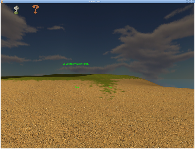
For the initial practice, I first cut to pieces that "bar" at the top and then put back together only a skeleton of it, as an overlay that has so far only the quit and help buttons - and those are my buttons indeed, made through my code and in a more direct way than the original entangled messes. The reason why the whole bar itself is still there as a thing at all is that it holds also quite a bit of the keyboard interaction part so there's more that needs to come away before it becomes fully clear if it comes off entirely or not. At any rate, otherwise I changed that pawsManager to actually act as one and therefore I have now in place the building blocks to allow the desired approach of "one window at a time and otherwise overlays". This also cut a lot of crap dances around all sorts but mainly in the sense of not using a lot of code, not yet in the final stages of deleting and discarding it too. For illustration, here's the new "menu bar" overlay and the confirmation window that a click on the Quit button made appear:
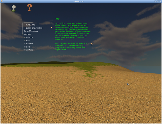
Once I had those buttons showing and working as I wanted them, the next step was to add various bits and pieces that arguably come in handy and could at least build on what I had so far. So I enhanced that minimal "helpwindow" of last time, as it's in my view the prototype for a generic view aimed to show structured text 3: it has now a title and there are also functioning scrollbars that use Eulora's own icon as tracker - I rather like them; the +/- signs for opening/collapsing a topic get shown now with their own icons in the skin.zip file; there's also further experimenting making sure that both background and text colour can indeed be set as desired:
I'll have to note here that the above is still not giving a damn about stuff like "borders" and stuffing buttons everywhere, from title to sidebars and anywhere in between. To be honest, I personally prefer by far the transparent and minimalistic windows and I make a half-hearted exception only for text really (as it's rather easier to read when it's the traditional black on white or gray on black). So if you'd really, really want those windows to have anything further, please say it sooner rather than later, as left on my own I doubt I'll find much reason to add even "title bars" as separate things, let alone stuff like border-this and border-that or decoration-here and decoration-there.
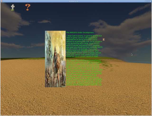
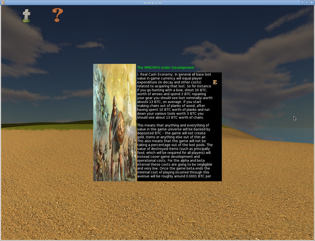
For further practice with making whole windows really from scratch rather than starting with a previous overgrown thing and cutting thorns at all steps while still remaining with a crooked trunk, I made also an "Info" view that is meant to show an image + name + description for anything in the world: it's barely a page of code and it even sets its size depending on how big your screen/eulora is, aiming only to maintain the ratio of its minimal size. The image gets indeed re-sized to fit exactly the space available in its side of the whole view so that's perhaps not ideal but it can be changed for sure. To fill it with something for testing purpose, here's the very info on Eulora itself, first in the transparent version and then with the black background for that half-hearted concession to showing text on a non-transparent background:
With the above done, my current list of generic views (aka windows+overlays) reads like this:
- Command line - TO DO. This is in my opinion crucial as it's meant to be the game's console basically, the only place for the player to enter commands and thus be able to do anything, whether there is a button for it yet or not. This would be an overlay, I should think.
- Confirmation - prototype DONE. This is a very basic yes/no type of window, aka one question + 2 buttons, modal thing. The current prototype is perfectly and fully working, if entirely transparent. The wiring of the buttons is now mine too, entirely circumventing the several layers of passing the buck that used to be "the way this is to be done". I don't know if there really is a need for any sort of other "view" as such - if it's just a text message, it can still be shown either directly on the screen (that fading sort of thing, dropping down as it faded) or otherwise in the console/command line thing above, I guess.
- Waiting - prototype DONE. This is meant as a placeholder/information for when the game is not available/unable to display the world as such. It simply takes over the whole game window and it displays an image + a label/text at the bottom. The prototype is fully functional and even wired in its correct place aka displaying at the start while the client is waiting to obtain from the server the most basic stuff such as who am I, where am I and what does this world even look like. I kept that boceto drawing as I quite like it (even more so than the "splash" thing).
- Info - prototype DONE. This is meant to show image+name+description (or any subset of those) of anything in the world.
- Contents - TO DO. This would show everything that is "inside" any given object in the world. As such, it could show the contents of some container but equally well the player's inventory or the equipped items or a storage or the contents of an exchange of any sort. In my current hazy view of it, this will simply show as many "slots" as required, each with their own icon + text (e.g. stack count and quality or similar) + tooltip (to show the name of whatever is in there).
- Exchange - TO DO. This would be made out of 2 Contents essentially, with wiring as appropriate for whatever specific exchange is shown at any given time. Basically the "inputs" would be the 2 items whose contents are to be shown on each side of this view. In my opinion and just as an example, this can even work to provide a GUI for activities such as "equip" since it's an exchange - stuff from inventory being moved into equipped and the other way around.
- Management/Ownership - TO DO. The details of this are not very clear to me currently but as I gather that there will be various types of managing involved (e.g. jobs or land), I've added this to the list as a generic window that can hopefully be made to cover adequately the management of whatever is needed. I'd say there is still time to figure out this in more detail and there's no rush - it's on this list as a type, not much more so far.
- Skills/Self - TO DO. This is quite hazy too but what I mean here is mainly a view that is able to show also things that require something other than image or text: perhaps bars/percentages or the like. I am not fully clear on this part yet but there's certainly time for it to clarify.
As next steps, I would push this a bit further still to fully transform that "helpwindow" into its intended generic structured content view and make otherwise at least a prototype of the Console/Command Line and Contents generic views. The Contents one is quite important because it means figuring out all that slots business and dragging stuff from one place to another, which is another potentially big chunk of this. Hopefully as part and parcel of that, I should be able also to finally delete another pile of useless code, as it ends up entirely stranded. In terms of specific GUI bits and icons, the more I work with this, the fewer of them I want in there so do let me know if there are *any* parts that you absolutely want in there as otherwise I'm afraid I might easily end up ditching just about *all* of them and have the whole "skin" consist in something like a plus, a minus, a quit icon, a help icon and a tracker for scrollbars, not much else really. Of course, anyone can otherwise ship to the client any .zip file with anything at all but the default client will not use anything else and keep those windows as minimal and as invisible as possible, by the looks of it.
Other than the above, let me know also if the approach of "generic views" makes sense to you and whether you'd like any others added to that list, even if just as general types, to be perhaps fleshed out (or discarded) later, as everything gets into more concrete shape.
- Heh. I know.[↩]
- Well, they'd be windows except when they are overlays and otherwise they are made still on top of and with various bits of the paws that apparently would really, really want to be of some use, if only it hadn't been so thorougly misdesigned and abused by means of pointerfuck...[↩]
- By structured text I mean here text that has a hierarchy of parts that can be shown/viewed separately and allow navigation through a tree of contents.[↩]
Comments feed: RSS 2.0


> as it's in my view the prototype for a generic view aimed to show structured text
I subscribe to the view.
> To be honest, I personally prefer by far the transparent and minimalistic windows
I don't prefer them in the general sense, I much prefer gothic-ornate windows.
I do prefer them however in context, because the less work that goes into the official client the better.
> I made also an "Info" view
Unwittingly in the process also redefining the venerable initialism MUD. All the better, it was high time some fresh life was blown into its dessicated corpse.
> This would be an overlay, I should think.
Traditionally games use a (leftover from Amiga days) strict key-action coupling. I expect having something like the unix terminal in there instead is, besides a^h the only possible good idea, also something long due -- it's an innovation that was required and yet was bypassed since the 90s at the least.
> so do let me know if there are *any* parts that you absolutely want in there
I think object icons are absolutely necessary. Otherwise inventory management becomes quite impossible.
It strikes me that my trouble there is not as much with the windows themselves as with the whole thing - I'd love ornate windows but with the full context to match and well, what's there is the sticks, so what gothic-ornate, it would fit ca nuca-n perete.
I had the reply before even getting to read this, ha!
Cool with all the rest including object icons - those were indeed in there, they are even mentioned as icon for the "slots" in the Contents view. The only thing is that I think those are not really part of a skin.zip but rather game art, pretty much on the same footing as the meshes, what if they are 2D instead. So each object in game can have a 3D representation (mesh/cal3d) and possibly also a 2D representation (aka icon) that gets shown in stuff like a Contents or Info view, why not. By contrast, the skin.zip is really concerned only with the interface itself, not with any game items and the fact that they are currently mixed (deployed client does indeed bundle all images together just because they are images) is not useful - for one thing the interface elements are all known upfront while the objects in game are not and for the other, why would making a new skin require making also new object icons, after all. Anyways, I suspect there's no real issue here but just to be clear: yes, certainly, all objects in game can have also an icon and the client should be able to display that where relevant, I agree. Probably the slots themselves will also have some background to make it easy to identify them /empty slots as such, indeed.
Meanwhile the "menu bar" came off entirely and without much trouble: its keyboard-part turned out on deeper examination to be just one layer stuffed in there for someone's desperate need of "must have buttons!!!" It turns out that it's entirely spurious really: I have the key-bindings (e.g. alt-q for "quit" or F1 for "help" working and showing the respective windows perfectly fine without any of those buttons so I cut out the whole controlwindow+controlledwindows shit and all is fine!
Let me know if there's any need for a "menu bar" at all. Just to be clear: key bindings, shortcuts and commands are going to work perfectly well without a "menu bar" or "button for opening up the inventory". This being said, if a menu window/bar is desired, I'll simply make it as a generic overlay or window, there's no trouble with that either and it can have buttons or whatever else we want it to have, too.
Nfi what it'd be needed for ; but if I find something I'll be sure to say something. In the meanwhile, congrats an' keep at it.
Thanks!
[...] or otherwise put "the" client. Currently there is indeed only one, for the very simple reason that I made it and nobody else made theirs. As a result, my client is and will remain the reference client but it's still not meant to remain [...]